October 14th, 2025
18 Best AI Analytics Tools for Collaborative Data Platforms [2025]
By Simon Avila · 27 min read
The best AI analytics tools for collaborative data platforms help teams explore data together, instead of working in isolation. Some tools, like Julius and Databricks, turn analysis into a shared experience with conversational interfaces and notebooks. Others focus on adding AI summaries or predictive insights.
I tested a wide range to see which ones actually make collaboration easier and narrowed it down to the top 18.
In this article, we’ll cover:
18 Best AI analytics tools
Top tools with in-depth reviews
Special mentions
How to choose the best tools
18 Best AI analytics tools for collaborative data platforms: At a glance
AI analytics platforms combine automation, visualization, and natural language analysis to make data exploration easier for both technical and non-technical teams.
Here’s a quick side-by-side look at 18 AI analytics tools that support collaboration:
Tool | Best for | Starting price (billed annually) | Key strength |
|---|---|---|---|
Collaborative AI data analysis | $29.16/month | Natural language queries, shared notebooks, and visual insights | |
Enterprise-scale collaboration | Pay as you go | AI-assisted analytics within existing Databricks pipelines | |
Teams on the Microsoft ecosystem | $14/user/month | Data visualization and collaboration across Excel, Teams, and Azure | |
Visual AI insights | $75/user/month for the Creator license | Auto-generated narrative summaries from Salesforce Einstein | |
Augmented team analytics | $200/month for 10 users | Associative engine for dynamic, interactive exploration | |
No-code collaboration | $25/month | Conversational dashboards for fast, team-friendly analysis | |
Shared dashboards | Free | Real-time Google integration for team visibility | |
Search-driven analytics | $25/user/month | Natural language search and live collaboration features | |
Predictive teamwork | Custom pricing | Team-ready forecasts with explainable AI models | |
Embedded analytics | Custom pricing | In-app collaboration and explainable AI visualizations | |
Regulated teams | $10.60/user/month | AI-assisted governance and role-based collaboration | |
Small business reporting | $24/month for 2 users | Team dashboards with built-in AI assistant | |
Collaborative data storytelling | Custom pricing | Blends SQL, Python, and visual reporting in shared workspaces | |
Developer-led data collaboration | $900/month (billed monthly) | Real-time coding notebooks for data exploration | |
Machine learning collaboration | Custom pricing | Collaborative model building and deployment features in enterprise-tier subscriptions | |
Open-source analytics collaboration | $19/month (billed monthly) | Workflow-based automation with team extensions | |
Spreadsheet collaboration | $25/month | Turns Sheets into searchable, AI-ready dashboards | |
Collaborative data notebooks | $36/editor/month (billed monthly) | Combines AI-assisted queries with live, shareable notebooks |
1. Julius: Best for collaborative AI data analysis
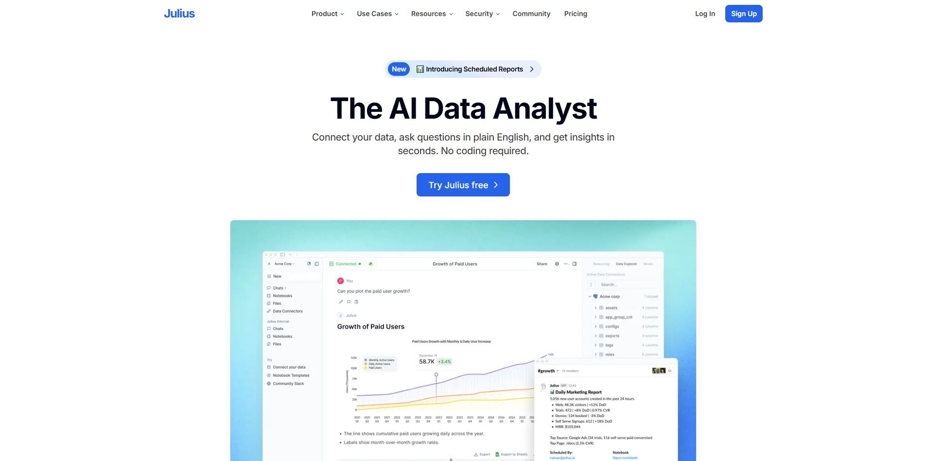
What it does: Julius lets teams explore shared data without relying on dashboards or SQL. You can connect sources like Snowflake, BigQuery, or Google Ads, ask questions in natural language, and share results in collaborative Notebooks.
Who it’s for: Business and data teams that want quick, consistent answers that they can turn into faster decisions and measurable results.
We designed Julius to make it easier for teams to get answers from data without building dashboards or writing SQL. You can connect sources like Snowflake, BigQuery, or Google Ads, then ask a question such as “revenue by region this week” and see a live chart quickly. You can save that view in a Notebook, add context, and share it so teammates can comment or reuse it later.
Scheduled reports can post directly to Slack or email, keeping updates in one place. When a query runs longer, Julius continues processing in the background until results are ready.
As you ask follow-ups like “break it down by product line,” Julius learns how your tables connect and which columns store certain metrics, so future queries resolve faster. Analysts can open the same Notebook, add code if needed, and publish updated charts for everyone.
Key features
Natural language queries: Ask questions in plain language and get accurate charts or summaries directly from your connected data sources.
Notebook collaboration: Save, comment, and share repeatable workflows with schedules.
Smarter over time: Julius learns how your data sources relate, so future queries run faster and return more accurate results without extra setup.
Pros
Fast sharing through links, Slack, and email.
Automatic retries keep long jobs running until complete.
Clear, ready-to-share visuals generated from each query.
Optional code cells for analysts, simple chat for business users.
Cons
Fewer visualization options than Tableau or Power BI.
Some SaaS connections need setup before use.
Pricing
Julius starts at $29.16 per month and includes access to advanced reasoning.
Bottom line
Julius works well for teams that want quick, everyday answers without relying on dashboards or technical setup. For deeper visualization options or enterprise-level governance, tools like Tableau or Qlik may be a better fit.
2. Databricks: Best for enterprise-scale collaboration
What it does: Databricks brings data engineering, machine learning, and analytics into one unified workspace. It supports SQL, Python, and R, so technical teams can build and share models or dashboards together.
Who it’s for: Data engineers and analysts who need to manage complex pipelines and collaborate on large datasets.
I tried Databricks to see how well it handled collaboration on bigger datasets. After connecting a few sources, I could run SQL and Python in the same notebook without switching tools, which made analysis smoother than I expected. The AI features surfaced quick insights and highlighted outliers in my data.
Getting everything configured took a bit of patience, but once the workspace was ready, sharing notebooks and dashboards with teammates was easy. We could comment, rerun queries, and build on each other’s work in real time. Databricks handled large data pulls without slowing down, but it clearly shines most when a team already has a solid data infrastructure and someone technical managing it.
Key features
Unified workspace: Combines engineering, analytics, and ML in one platform.
Collaboration tools: Shared notebooks for code, comments, and visualizations.
AI integration: Supports automated insights and forecasting with Databricks Mosaic AI.
Pros
Handles massive datasets efficiently.
Supports both code-first and visual workflows.
Strong version control and reproducibility.
Cons
Setup and management require technical expertise.
Pricing scales quickly with usage.
Pricing
Databricks uses a pay-as-you-go model where costs depend on your compute and storage usage. Cost increases with workload size, and you can estimate your expenses using the pricing calculator.
Bottom line
Databricks is ideal for technical teams that want to collaborate on large-scale analytics in a single environment. For smaller teams or simpler reporting, lighter tools like Julius or camelAI may be easier to manage.
3. Power BI: Best for teams on the Microsoft ecosystem
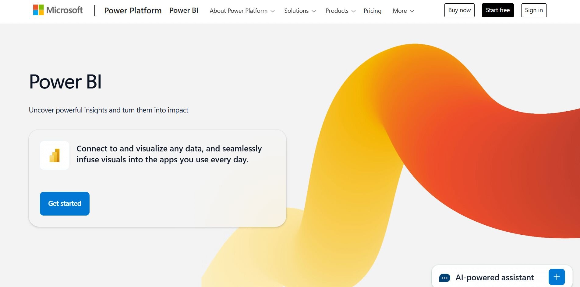
What it does: Power BI connects data across Excel, Teams, and Azure to create visual dashboards that update in real time. It supports AI-driven insights through Copilot and integrates directly into Microsoft 365.
Who it’s for: Teams already using Microsoft tools that want to centralize reporting and analysis.
I used Power BI to combine data from Excel and Azure SQL, then shared the dashboard directly through Teams. Building visuals was simple once I got used to the interface, and Copilot helped summarize trends automatically.
Everyone could view, filter, and comment without exporting files, which made collaboration smoother across departments. Performance was solid on moderate datasets, though larger models needed tuning to load faster. Power BI integrated naturally with my existing workflow and let my team analyze and share data directly inside the tools we already used, like Teams and Excel.
Key features
AI assistance: Copilot generates summaries and natural language insights.
Native integrations: Connects with Excel, Teams, and Azure.
Real-time dashboards: Updates automatically as data changes.
Pros
Easy sharing within Microsoft 365.
Strong security and governance controls.
AI features simplify trend analysis.
Cons
Interface can feel busy for new users.
Limited flexibility outside Microsoft ecosystem.
Pricing
Power BI starts at $14 per user per month.
Bottom line
Power BI works best for teams already embedded in Microsoft’s tools who want simple, AI-supported dashboards they can share across departments.
4. Tableau: Best for visual AI insights
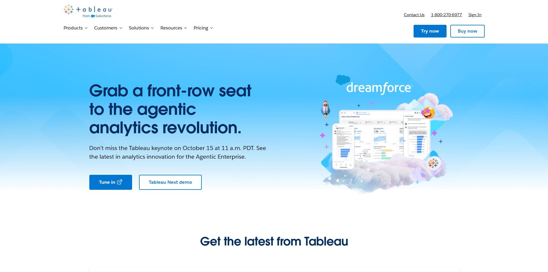
What it does: Tableau turns raw data into interactive visuals and dashboards. It supports AI-generated explanations through Salesforce Einstein and offers deep customization for charts and reports.
Who it’s for: Analysts and business users who prioritize design flexibility and visual storytelling.
When I tested Tableau, I built a sales performance dashboard using several CSVs and a Snowflake connection. The drag-and-drop builder made it easy to try different chart types and spot relationships I hadn’t planned to explore. The Einstein integration automatically summarized why key metrics shifted week to week, which saved time explaining changes to stakeholders.
Collaboration through Tableau Cloud worked well once I set clear roles and permissions. The visuals were some of the most detailed I’ve produced, though the setup took longer compared to AI-first tools like Julius or camelAI.
Key features
AI explanations: Einstein AI adds context and plain-language summaries.
Advanced visuals: Highly customizable dashboards and charts.
Collaboration: Share dashboards securely through Tableau Cloud.
Pros
Rich visualization and design control.
Reliable enterprise-grade performance.
Strong community and learning resources.
Cons
Steeper learning curve for new users.
Requires setup and licensing for collaboration.
Pricing
Tableau starts at $75 per user per month for a Creator license.
Bottom line
Tableau is ideal if you need flexible, detailed visuals that tell a story. For faster, conversational insights, platforms like Julius might be more intuitive.
5. Qlik Sense: Best for augmented team analytics
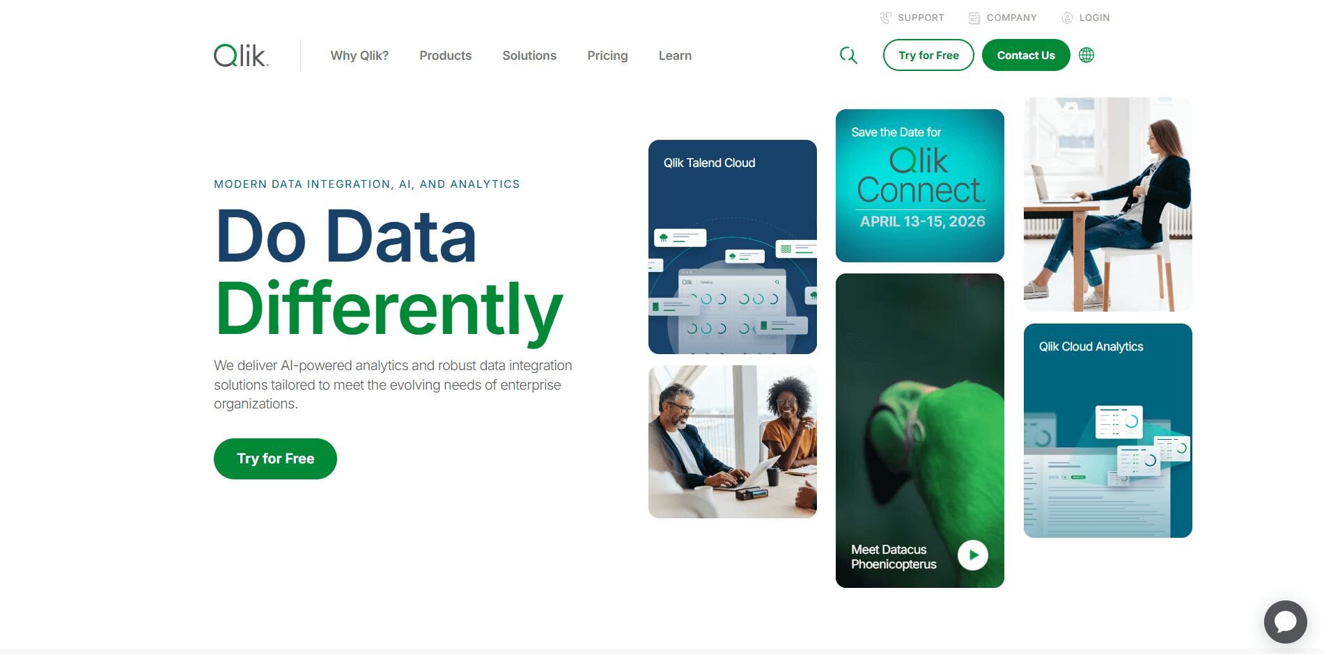
What it does: Qlik Sense is an AI-powered analytics platform that helps teams explore data freely without predefined filters or queries. Its associative engine links data across tables, making it easy to uncover connections that traditional BI tools can miss.
Who it’s for: Teams that want to explore data interactively and collaborate on flexible dashboards instead of static reports.
I tested Qlik Sense by connecting a marketing dataset and exploring it through its associative engine. I moved between campaign metrics freely and spotted how shifts in ad spend affected engagement across regions.
The conversational panel let me ask follow-up questions and update visuals fast, which made deeper analysis easier and more natural. Sharing dashboards through Qlik Cloud kept my team’s reviews quick and collaborative without extra exports. The process made analysis more interactive and helped me uncover trends that traditional dashboards would have missed.
Key features
Associative engine: Explore data freely across multiple sources.
Conversational analytics: Ask follow-up questions in natural language.
Shared dashboards: Build and distribute visual reports easily.
Pros
Enables flexible, non-linear analysis.
Fast and stable performance for medium datasets.
Encourages collaboration through shared dashboards.
Cons
Interface takes time to learn for new users.
Requires optimization on large or complex joins.
Pricing
Qlik Sense starts at $200 per month for 10 users.
Bottom line
Qlik Sense suits teams that value discovery-driven analysis and want AI assistance that keeps exploration fluid and collaborative. It’s less intuitive for beginners, but once you learn the workflo
6. camelAI: Best for no-code collaboration
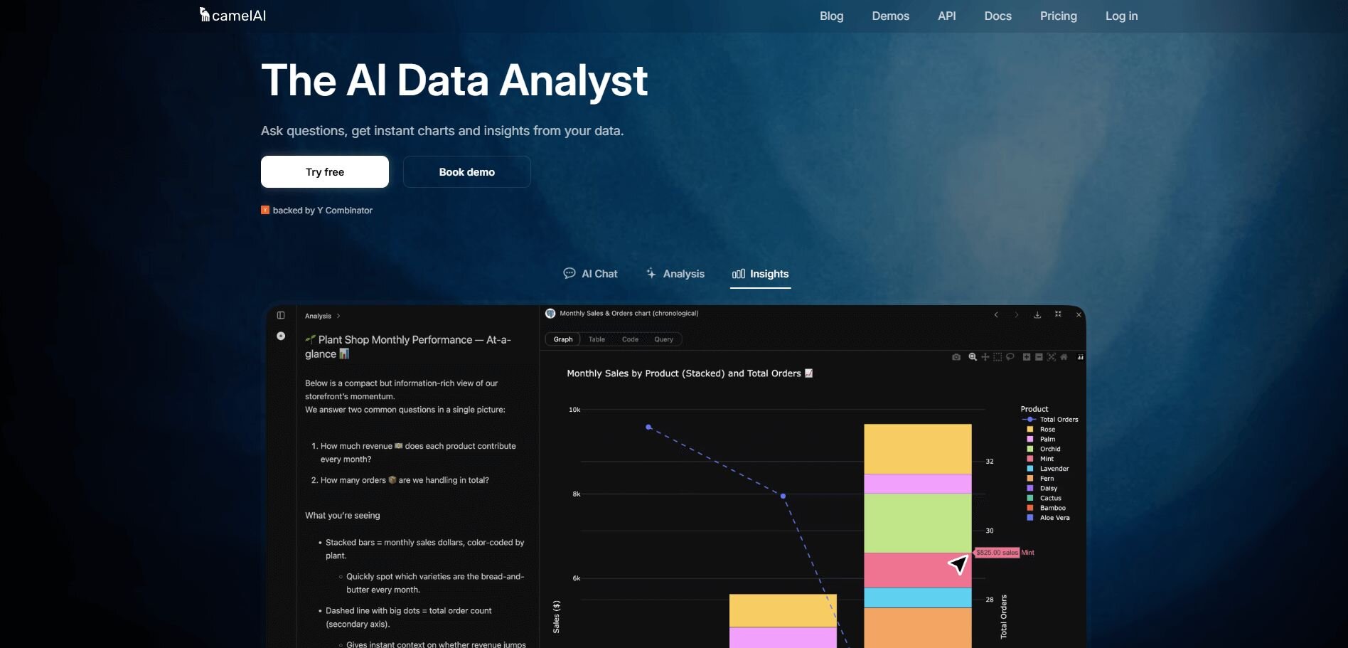
What it does: camelAI is a conversational analytics tool that lets teams create dashboards and summaries through natural language prompts instead of code. It’s designed for fast insights and collaborative exploration across shared datasets.
Who it’s for: Non-technical teams that need quick, automated reports without building complex models or visualizations manually.
While exploring camelAI, I uploaded a customer retention dataset and built dashboards entirely through prompts. Within minutes, I had charts showing churn by segment, top cancellation reasons, and weekly trends, all generated automatically.
Collaboration was smooth since teammates could ask their own questions in the same workspace and see updates in real time. When I added new data, the visuals refreshed quickly, keeping reports accurate without extra steps. camelAI was quick and simple to use, though its chart options were limited compared to larger BI tools.
Key features
Prompt-based dashboards: Build reports through conversational AI.
Instant refresh: Auto-updates when new data is uploaded.
Team collaboration: Shared workspaces for questions and comments.
Pros
Fast setup with zero code required.
Refreshes data automatically after updates.
Great for non-technical team collaboration.
Cons
Limited visualization customization.
Less suitable for advanced analytics or modeling.
Pricing
camelAI starts at $25 per month for unlimited messages and dashboards.
Bottom line
camelAI delivers quick, conversational insights that help teams work together and keep reports up to date without extra effort. It’s not built for deep customization, but it makes everyday analysis faster and easier to share.
7. Looker Studio: Best for shared dashboards
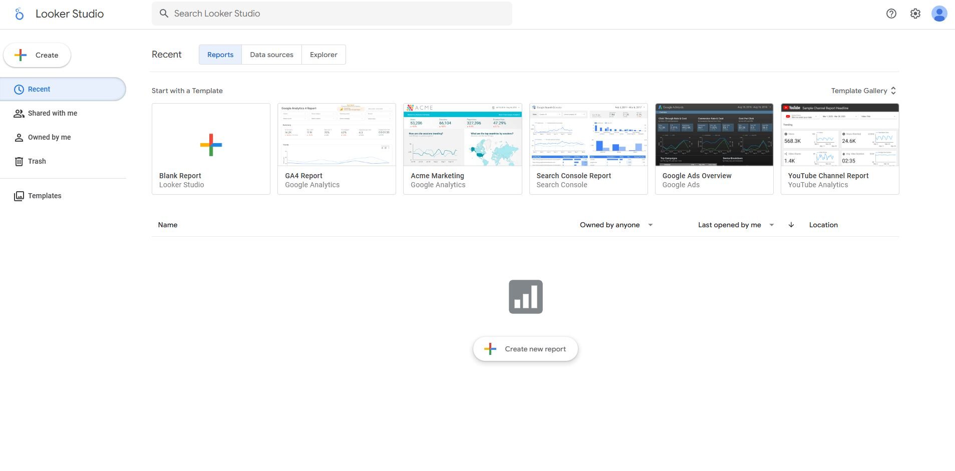
What it does: Looker Studio (formerly Data Studio) helps teams create shareable dashboards that connect directly to Google products and other data sources.
Who it’s for: Marketing and analytics teams that need free, collaborative reporting tied to Google Workspace.
When I connected Looker Studio to Google Analytics and Sheets, I was able to build a campaign performance dashboard pretty quickly. The drag-and-drop editor made it simple to blend data and customize visuals without setup delays.
Sharing was seamless. My teammates opened the same dashboard, applied filters, and left comments without exporting files. It handled moderate datasets easily, though complex queries slowed down rendering. I liked how it kept reporting close to our existing Google workflow, making collaboration effortless for anyone already using Workspace daily.
Key features
Native Google integrations: Connects to Analytics, Ads, and Sheets instantly.
Custom dashboards: Visualize metrics in drag-and-drop reports.
Collaborative editing: Real-time sharing and comments.
Pros
Free for most users.
Simple for teams already using Google tools.
Easy to share and update dashboards.
Cons
Slower on large or complex datasets.
Limited advanced modeling features.
Pricing
Looker Studio is free for all Google account users.
Bottom line
Looker Studio is ideal for teams that rely on Google tools and want a free, collaborative way to visualize and share performance metrics.
8. ThoughtSpot: Best for search-driven analytics
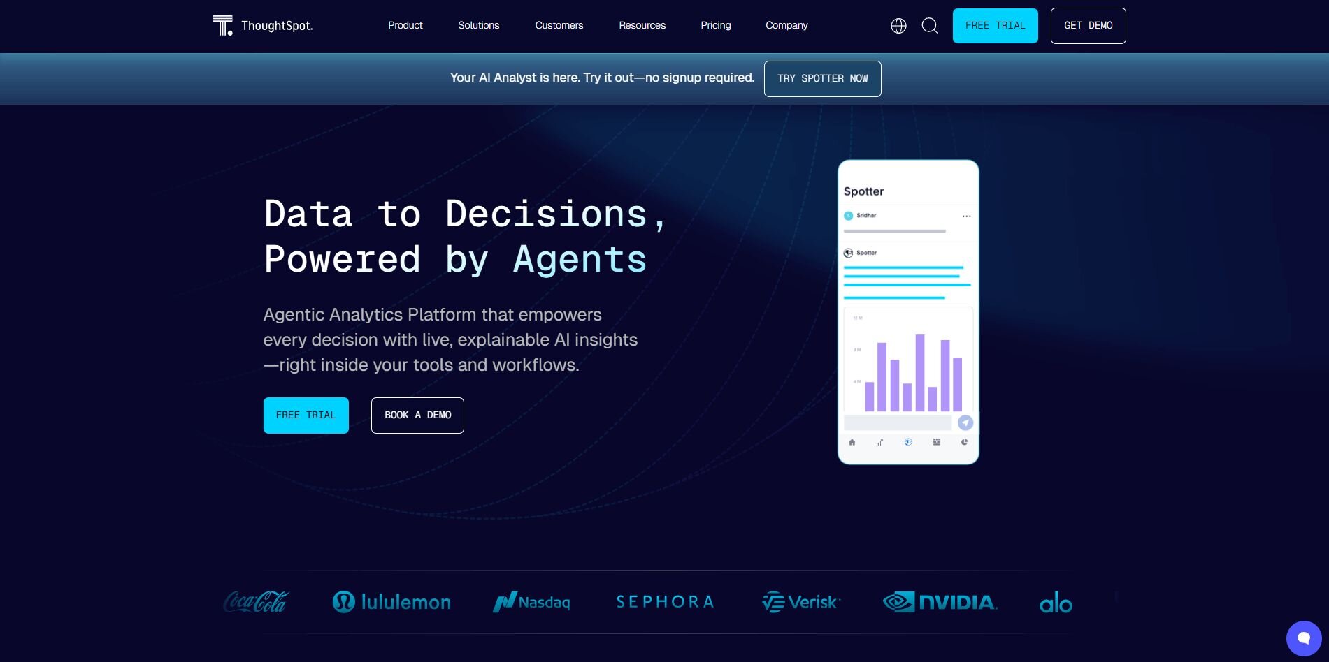
What it does: ThoughtSpot uses a search-based interface that lets you type questions in plain English to generate interactive charts and insights.
Who it’s for: Companies that want quick, AI-driven answers across complex datasets.
Using ThoughtSpot was like querying data the same way I search the web. I connected a sales dataset and typed “quarterly revenue by product,” and the platform generated a clean chart quickly. I added filters to explore trends by region and customer type without writing a query.
The AI explanations were clear and saved time when I built slide decks. I also liked that sharing insights with my teammates was straightforward through shared links and scheduled reports. It took some learning early on, but once I got comfortable, the speed and accessibility made a difference.
Key features
Search-based analysis: Type questions and get instant visuals.
AI explanations: Automatic context and summaries.
Sharing and scheduling: Export or automate recurring reports.
Pros
Extremely fast answers from large datasets.
Reduces dependence on analysts.
Easy sharing for non-technical users.
Cons
Needs clean, well-modeled data.
Steeper learning curve for new teams.
Pricing
ThoughtSpot starts at $25 per user per month.
Bottom line
ThoughtSpot is a strong choice for teams that want fast, intuitive data exploration powered by AI-driven search. It takes time to set up clean, structured data, but once configured, it makes self-service analysis easier.
9. Akkio: Best for predictive teamwork
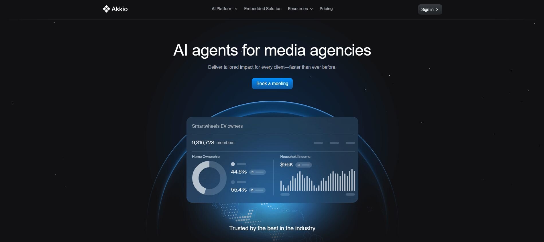
What it does: Akkio helps teams build predictive models using plain language and simple data uploads, turning raw data into forecasts fast.
Who it’s for: Business teams that want to apply predictive analytics without coding or managing ML pipelines.
I uploaded a churn dataset into Akkio and it quickly identified which customers were most likely to cancel. After I chose the churn column as the target, the platform split the data, trained the model, and showed accuracy scores quickly. Akkio highlighted key factors driving cancellations, which made it easy to explain results in a meeting.
I also liked that sharing models with teammates was simple, and updates synced automatically. It can also support basic cluster analysis, which helps group similar customers before running predictions for more accurate insights.
Key features
No-code predictive modeling: Train, test, and deploy models fast.
AI explanations: Highlights key drivers behind predictions.
Shared dashboards: Collaborate on forecasts and outcomes.
Pros
Quick setup for non-technical users.
Clear explanations improve understanding.
Supports real-time updates.
Cons
Limited customization for advanced users.
Narrow focus on predictive use cases.
Pricing
Akkio offers custom pricing. Contact sales to learn more.
Bottom line
Akkio is ideal for teams that want to experiment with predictive analytics and turn data into quick, actionable forecasts without code or long setup.
Special mentions
There were more tools that impressed me during testing, but I couldn’t fit all of them into the main list. These platforms still delivered solid results and are worth checking out if you’re comparing options for your team. Here are the others to keep on your radar:
Sisense: I used Sisense as a collaborative analytics platform to embed insights directly into a client dashboard. It blended SQL-based reports with AI-generated explanations so users could interpret data without extra training.
IBM Cognos Analytics: While testing Cognos, I focused on AI-powered data analysis across enterprise datasets that required strict governance. The AI assistant produced quick summaries and insights, and the audit trail kept every change traceable for compliance.
Zoho Analytics: On a small business reporting project, I used Zoho Analytics for its affordability and simple automation. Its Zia assistant made querying easy and intuitive. I think Zoho is a pretty good AI tool for data analysts, since it can save time on everyday reporting, even if customization is pretty basic.
Mode: I used Mode to collaborate with a data science team that combined SQL, Python, and visual reporting in one workspace. It acted as flexible research collaboration software, letting us move between code and visuals seamlessly. The integrated editor reduced handoffs and helped us present results faster.
Observable: When I needed flexibility for data storytelling, Observable allowed me to build and share interactive JavaScript visualizations. The platform supported real-time editing, which made AI-driven data analytics discussions more dynamic. However, I do think it catered more to developers than business users.
RapidMiner: I tried RapidMiner to build predictive models for a marketing dataset. Its drag-and-drop workflow made testing algorithms quick and approachable for teams experimenting with AI tools. It handled moderate data volumes smoothly, though complex setups required some manual prep.
KNIME: I used KNIME to automate routine reporting and connect multiple data sources in one place. The node-based design simplified repetitive jobs and gave analysts visibility into every step. It’s pretty good for teams that prioritize transparent workflows and clear handoffs.
Polymer: When I was building simple reports, I connected Google Sheets to Polymer and turned my spreadsheets into interactive dashboards. The AI organized columns automatically, which made it easier to explore and filter metrics.
Hex: While testing Hex, I built dashboards with both code and AI assistance in a shared workspace. It balanced technical flexibility with collaboration, making it useful for teams that mix coding and visualization. The live sharing and AI query support made it practical for everyday use.
How I chose the best AI analytics tools for collaborative data platforms
After years of testing analytics tools across startups and enterprise environments, I’ve learned how much real-world performance matters beyond feature lists. The difference often comes down to how well a tool fits into a team’s workflow and how quickly it delivers insights you can actually use.
For this review, I connected each platform to live datasets from ad campaigns, web analytics, and financial records to see how they handled everyday analysis. I watched how quickly dashboards refreshed, how smooth collaboration felt, and how AI features actually supported the work instead of slowing it down.
I also focused on:
Ease of setup: How quickly a new data source could be connected without engineering help.
Latency: How fast dashboards and reports refreshed after updates.
Actionability: Whether insights included recommendations, anomaly detection, or next steps worth acting on.
Collaboration: How simple it was to share results through Slack, email, or links.
Scalability: How well each tool handled large datasets under pressure.
AI support: Whether natural language queries and auto-summaries genuinely saved time.
Customization: How flexible dashboards, alerts, and workflows were for real business needs.
Which AI analytics tool should you choose?
No single platform covers every use case, and the right choice depends on your team’s size, data complexity, and how you share results. Choose:
Julius → if you want fast, plain-language analysis that keeps teams aligned through shared Notebooks.
Databricks → if you’re managing enterprise-scale data pipelines and want built-in AI assistance.
Power BI → if your team already works in the Microsoft ecosystem and values integration with Excel and Teams.
Tableau → if you need detailed visualizations with automated explanations from Einstein AI.
Qlik Sense → if you prefer interactive, discovery-driven analysis over static dashboards.
camelAI → if you want quick, conversational dashboards without code or setup delays.
Looker Studio → if you need a free way to build and share Google-connected dashboards.
ThoughtSpot → if you want to search your data the same way you’d search the web.
Akkio → if you’re adding predictive insights to team workflows without relying on data scientists.
Sisense → if you’re embedding analytics directly into your product or client dashboard.
IBM Cognos Analytics → if governance, audit trails, and compliance are top priorities.
Zoho Analytics → if affordability and ease of use matter more than advanced customization.
Mode → if you’re collaborating across SQL, Python, and visualization in one shared workspace.
Observable → if your team prefers custom data storytelling and interactive visuals.
RapidMiner → if you need a no-code environment for testing predictive models quickly.
KNIME → if you’re automating repeatable workflows across multiple data sources.
Polymer → if you want to turn spreadsheets into interactive dashboards for simple reporting.
Hex → if you’re mixing code, AI queries, and live collaboration in one notebook.
My final verdict
Collaboration was the biggest differentiator in testing these platforms. The strongest tools were the ones that made insights easy to share, discuss, and act on.
Julius stood out because it made collaboration effortless for mixed-skill teams. Everyone could ask questions, explore live data, and share results in the same Notebook without relying on analysts to translate or rebuild dashboards.
Other platforms excel in their own ways. Tableau offers unmatched visualization depth, Databricks handles enterprise-scale pipelines, and ThoughtSpot delivers quick answers through search.
If your goal is to make data a team conversation instead of a technical bottleneck, Julius is where I’d start.
Start analyzing data together with Julius
If you’re comparing the best AI analytics tools for collaborative data platforms, the real difference comes down to how fast your team can turn data into shared insights.
Julius brings that collaboration front and center with plain-English queries, shared Notebooks, and automated updates straight to Slack or email.
Here’s how Julius can help:
Quick single-metric checks: Run a simple univariate analysis to see averages, spreads, or distributions, and Julius displays the results instantly with a clear, easy-to-read chart.
Built-in visualization: Get histograms, box plots, and bar charts on the spot instead of jumping into another tool to build them.
Catch outliers early: Julius highlights values that throw off your results, so decisions rest on clean data.
Recurring summaries: Schedule analyses like weekly revenue or delivery time at the 95th percentile and receive them automatically by email or Slack.
Smarter over time: With each query, Julius gets better at understanding how your connected data is organized. That means it can find the right tables and relationships faster, so the answers you see become quicker and more precise the more you use it.
One-click sharing: Turn a thread of analysis into a PDF report you can pass along without extra formatting.
Direct connections: Link your databases and files so results come from live data, not stale spreadsheets.
Ready to see how Julius can get you insights faster? Try Julius for free today.
Frequently asked questions
Are there free AI analytics tools for teams?
Yes, some tools like Looker Studio, Zoho Analytics, and KNIME offer free versions with shared dashboards and real-time editing. They’re good for testing collaboration before scaling. Free plans work well for small projects but have limits compared to full BI dashboard platforms.
Can small businesses benefit from collaborative AI analytics tools?
Yes, small businesses can benefit from using collaborative AI analytics tools like Julius or camelAI to connect sales, marketing, and finance data in one workspace. These platforms simplify reporting without code and reveal performance trends faster. Many also integrate with financial analysis software for clearer decision-making.
How secure is data shared on AI collaboration platforms?
Data shared on AI collaboration platforms is generally secure because most use encryption both in transit and at rest. They also follow compliance standards such as SOC 2 and GDPR to protect sensitive information. Enterprise tools add role-based access controls, and if you use a data mesh setup, look for platforms that maintain those access boundaries.
