October 14th, 2025
What Is Data Interpretation? Methods, Tools, & Examples in 2025
By Simon Avila · 17 min read

Data interpretation explains what your numbers are saying and why they matter. It’s how a business learns that sales dipped because of pricing, not marketing, or how a researcher uncovers trends hidden in trial results.
In this guide, I’ll break down what data interpretation means, the methods professionals rely on, and the 5 tools that make it easier in 2025.
In this article, we’ll cover:
What data interpretation is
Methods of data interpretation
5 tools
Benefits and challenges
How to improve your data interpretation skills
What is data interpretation?
Data interpretation means explaining what your data reveals and why it matters. It helps uncover patterns, relationships, and insights that guide better decisions. While data analysis organizes information, interpretation connects results to real situations and explains their meaning.
For example, when I reviewed customer survey data for a retail client, the numbers showed a dip in satisfaction. After interpreting the results, I found the real issue wasn’t the products but the delayed delivery times. That insight helped the team shift focus to logistics instead of product design, which quickly improved their scores.
5 Methods of data interpretation
Each type of data interpretation reveals a different side of your information. Some methods measure patterns, while others explain the reasons behind them. Here are five methods that show how data turns into useful insight:
1. Quantitative methods
Quantitative interpretation focuses on measurable results. It includes statistical models, regression, and univariate analysis, which looks at one variable at a time to describe its behavior.
For example, I once reviewed six months of sales data for an online clothing store to study how seasonal discounts affected average order value. By focusing on that single variable, I found that large discounts boosted short-term sales but lowered the overall purchase amount per customer once the promotion ended.
2. Qualitative methods
Qualitative interpretation helps explain why patterns occur. It uses thematic coding and content analysis to identify recurring themes in text or feedback.
I applied this when reviewing open-ended customer survey responses for a hospitality client. By grouping similar comments, I could pinpoint recurring frustrations around booking changes, which numbers alone didn’t show.
3. Correlation and relationships
Correlation analysis shows how two variables move together. A strong positive correlation means they rise or fall at the same time, while a negative one shows the opposite trend. I used this to compare ad spend and lead quality across campaigns. The results confirmed that higher budgets improved reach but not conversion, which helped adjust future targeting.
4. Clustering and segmentation
Cluster analysis groups data points that share similar traits. It’s useful for segmenting customers, products, or behaviors. I ran this method for an e-commerce client to separate repeat buyers from first-time shoppers. Those clusters revealed clear differences in purchase timing and product interest, allowing for more precise promotions.
5. Testing consistency and accuracy
Reliability analysis checks whether your data produces consistent results across samples or measurements. It’s a key step before drawing conclusions, since unreliable data can lead to false insights or wasted effort.
When I tested an employee feedback survey for a logistics company, I used this method to see if satisfaction scores stayed consistent across different departments and months. The results confirmed that the same questions produced stable answers each time, showing the survey was reliable enough to track long-term morale trends accurately.
5 Tools and platforms for data interpretation
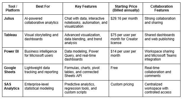
I’ve worked with both traditional BI platforms and newer AI-powered systems, and each one fits a different type of project. Some tools help you visualize trends, while others focus on automation or team sharing.
Here are five tools I’ve used to make interpreting data faster and more reliable in 2025:

Benefits of data interpretation across industries in 2025
Data interpretation has become one of the most valuable skills in 2025. With data flowing in from every system and tool, teams need to be able to understand what the numbers mean.
Here are some of the key benefits of strong data interpretation in different industries:
Business intelligence: By analyzing which key performance indicators predict performance, businesses can focus resources where they matter most. For example, I worked with a retailer that discovered higher revenue came from returning customers rather than from attracting new visitors.
Finance: Accurate interpretation helps forecast cash flow, detect risk early, and explain why projections change month to month. I once worked with a finance team that caught a billing delay issue only after interpreting weekly payment trends, not just viewing totals.
Healthcare: Interpreting medical data helps spot early indicators in patient outcomes or treatment results. It’s how hospitals identify recurring complications, like patterns in readmission rates or recovery times, that might not appear in surface-level analysis.
E-commerce: Understanding how different customer segments behave can reveal which products or discounts truly impact repeat purchases. I’ve used this to help brands reallocate budget toward the categories that drive retention.
AI-driven insights: Tools like Julius now automate repetitive steps like cleaning and summarizing data. This lets analysts spend more time interpreting trends, relationships, and root causes instead of preparing datasets.
Common challenges in data interpretation
Even with the best tools, interpreting data isn’t always simple. I’ve seen teams draw the wrong conclusions because of flawed inputs, biased assumptions, or rushed reviews. Knowing what can go wrong is part of becoming better at analysis.
Here are some common challenges you might run into:
Poor data quality: Missing values, duplicates, and outliers distort trends. For example, when I analyzed sales data with missing regional entries, it initially looked like one branch underperformed when its data just hadn’t synced.
Human bias: Analysts and managers sometimes see what they expect to see. Confirmation bias can turn neutral results into “proof” for a preferred outcome.
False correlations: Two variables can rise together without being related. I once saw a team credit a marketing email for a revenue jump that was actually caused by payday timing.
Overfitting models: When predictive models match past data too closely, they often miss new patterns. This can make relationships appear stronger than they are and lead to plans that don’t hold up in real situations.
Context loss: Data without background can mislead. For instance, a traffic increase might look positive until you interpret it alongside conversion data and realize most visits were from irrelevant audiences.
Each challenge shows why human interpretation still matters, even with advanced AI. The numbers might be correct, but their meaning depends on how you read them.
How to improve your data interpretation skills
Strong interpretation skills come from practice and curiosity. Improving how you read, visualize, and question data can make analysis more reliable. Here are four ways to build those skills in 2025:
Develop statistical literacy
Understanding basic statistics helps you spot patterns and catch mistakes faster. I’ve seen teams improve by taking short courses and practicing with sample datasets to calculate averages, variance, and confidence intervals. Reviewing real company data helps too.
One finance team I trained learned to compare means and medians correctly, which stopped them from misreading income fluctuations as growth. A few hours of practice each week builds confidence fast.
Use visualization to simplify insights
Good visualization makes data easier to understand by helping you see patterns and outliers that you might miss by looking at numbers alone. I like using tools like Julius or Tableau to test different chart styles on the same dataset. Practicing this way shows how each visual highlights a different part of the story and teaches you which format works best for the insight you want to share.
Practice with case studies and real-world datasets
Working with real data builds your confidence. One thing you can do is explore public datasets and interpret them independently to practice spotting trends and drawing conclusions on your own. Good examples include sales reports or customer surveys that show real-world variability in data.
When I mentor new team members, I ask them to explain what the data means in one sentence before creating charts or summaries. It trains them to focus on clarity first.
Apply AI-driven tools for efficiency and accuracy
AI-powered platforms like Julius help simplify repetitive analysis and make unusual patterns easier to spot. We designed Julius to let you ask questions in natural language and explore relationships between metrics through charts and summaries.
Examples of data interpretation
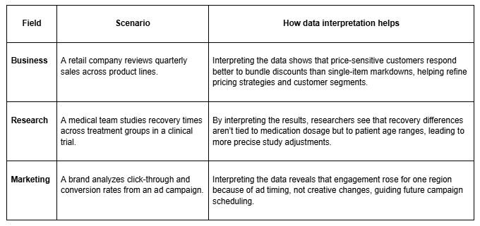
Data interpretation looks different across industries, but the goal is always to understand what the numbers reveal and use that insight to make informed decisions.
Here are a few hypothetical examples that show how this works in practice:

AI and the future of data interpretation
AI is changing the way we interpret data by taking over the tedious parts of analysis. Here’s how:
Machine learning models can spot patterns that people might miss, like how small changes in website speed affect cart abandonment. I use these models to track customer behavior across regions and then apply data mapping to link each trend back to product type and pricing. What used to take days of sorting now takes minutes.
Generative AI is also making it easier to summarize complex datasets. I’ve seen it turn thousands of rows into a short overview that highlights top-performing categories or unusual dips in performance.
But AI still needs a human in the loop. It doesn’t understand business context and can mistake random spikes for real trends. The best results come when people use AI for speed and accuracy, then rely on judgment to decide what the data truly means.
How Julius can help with data interpretation
Julius makes data interpretation faster and easier by letting you explore your data in natural language. You can ask questions, run visual reports, and share findings in minutes instead of digging through spreadsheets or waiting on analysts.
Here’s how Julius supports better interpretation:
Quick single-metric checks: Ask for an average, spread, or distribution, and Julius shows you the numbers with an easy-to-read chart.
Built-in visualization: Get histograms, box plots, and bar charts on the spot instead of jumping into another tool to build them.
Catch outliers early: Julius highlights values that throw off your results, so decisions rest on clean data.
Recurring summaries: Schedule analyses like weekly revenue or delivery time at the 95th percentile and receive them automatically by email or Slack.
Smarter over time: With each query, Julius gets better at understanding how your connected data is organized. That means it can find the right tables and relationships faster, so the answers you see become quicker and more precise the more you use it.
One-click sharing: Turn a thread of analysis into a PDF report you can pass along without extra formatting.
Direct connections: Link your databases and files so results come from live data, not stale spreadsheets.
Ready to see how Julius can get you insights faster? Try Julius for free today.
Frequently asked questions
How can my enterprise improve its data interpretation skills?
Your enterprise can improve data interpretation by training teams to connect metrics with real outcomes like revenue or customer behavior. Host sessions where departments interpret the same dataset and compare conclusions to align understanding and avoid isolated decisions.
Which tools are best for interpreting analytics?
Julius is one of the best tools for interpreting analytics because it lets you ask questions in plain English and get fast visual answers. Other tools include Tableau and Power BI, which support deeper dashboard analysis. Pick the platform that fits your data sources and how your team makes decisions.
What’s the most common mistake in data interpretation?
The most common mistake is drawing conclusions without checking context. Many teams act on surface-level trends without exploring what drives them, such as missing data, outliers, or unrelated correlations. Reviewing sample sizes, comparing time frames, and confirming data quality before making a decision helps avoid these errors.
Can data interpretation be automated with AI platforms?
Yes, AI platforms can automate parts of data interpretation, like detecting anomalies, summarizing results, and visualizing patterns. However, full interpretation still needs human judgment. Tools like Julius can highlight relationships or outliers, but people provide the context, reasoning, and experience that turn those findings into decisions.
